Editor's Note: In this week's issue, Peter discusses why "Design Matters" more than ever. And in an extension of the Rant, we showcase the new Hyundai 6 concept in "On The Table", as well as an appearance by Devo as featured in our AE Song of the Week. Peter's next chapter of "The Muscle Boys" can be found in Fumes, which is his glorious take on big-bore V8s in American sports car racing. And in The Line we have coverage of F1 from Silverstone, INDYCAR from Mid-Ohio, IMSA from Canadian Tire Motorsports Park, and NASCAR and Trans Am from Road America. Enjoy! -WG
By Peter M. DeLorenzo
Detroit. In a previous column about “blandtastic” design, I stirred the pot yet again among the AE faithful as well as with industry insiders. Some readers were stunned at the profile similarities on display from the different manufacturers, which is understandable when you’re really able to see them juxtaposed against one another.
But then again, it shouldn’t really have come as a surprise. The members of the design community have mimicked and frankly ripped off each other for decades now. The design schools have contributed to this phenomenon by churning out graduates taught with similar perspectives who then go to work at the manufacturers’ design houses. Yes, of course, safety standards and interior packaging requirements come into play, but the systematic blandness that has overrun what should be the most exciting part of the business has resulted in a homogenization of design that is debilitating.
As I’ve often said, design is the Ultimate Initial Product Differentiator, and in the transition to the EV Age, compelling design will become even more critical. With similar battery platform designs – aka “the skateboard” – and other technical commonalities such as range and charging capability, the look and street presence of vehicles will directly affect consumer desire. That’s not to say that interior design isn’t important – because it certainly it is – after all, that’s where we spend all of our time when driving. But exciting, breakthrough interiors will never be enough on their own; you first have to lure the consumer in for a closer look, and it’s the exterior design that does that, no matter how impressive the interior is.
Since Day One of the automotive design business, which started with the “Art and Colour” department at General Motors in the 1930s under Harley Earl’s direction, the concept of design “reach” has been an ongoing battle. The easiest thing to do in the design business – before Earl arrived on the scene – was to stay the course, do a few tweaks and call it good. This attitude sustained itself more often than not over the previous decades. But in Detroit’s heyday, roughly from the mid-50s to the early 70s – when GM Styling (now Design) often set the tone for the entire mainstream automobile industry – every year was a momentous year, because "design reach" were the operative words of the day. Staying in place was not an option back then, and each year a series of breakthrough designs was unleashed on the long-since-lost “Announcement Day,” with the manufacturers vying for consumer attention with designs that made the previous year’s lineup instantly obsolete. (Planned obsolescence wasn’t always a bad thing.) And, Bill Mitchell, Earl’s gifted successor, was the absolute Maestro at it.
Understanding this and despite what I presented previously, all is not lost, however, as evocative designs – though few and far between – still have a way of surfacing, which is a very good thing. Given what I know, I have a few comments on what’s out and what’s coming…

(BMW)
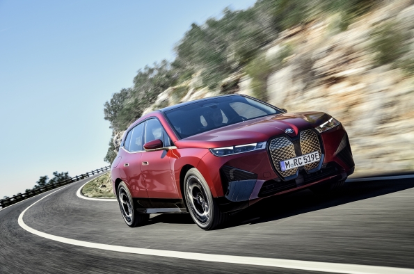
I was super critical of BMW’s move to the overexaggerated front-end in the past, but I will give BMW designers this: 1. At least they have a distinct point of view that is directly influenced by memorable designs from the earliest beginnings of the company. And 2. The front end and the non-functioning grille actually work best on their crossovers/SUVs. That doesn’t mean I am exactly warming up to the look, but I get it. If there were ever a graphic demonstration of "design reach," this is it.
(BMW)
The front end on upcoming electric SUVs will have other functions – to house myriad sensors, etc. – and from a road presence perspective there will be no mistaking when a BMW is coming at you.
(BMW)
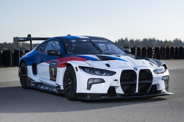
The front end on the BMW sedans can look added on and unattractive, but I will admit that the racing version of the BMW coupe is not bad. Not bad at all.
(Mercedes-Benz)
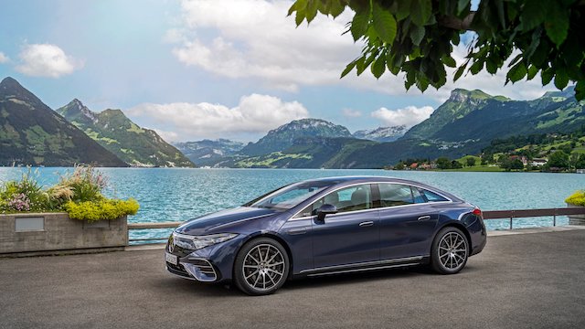
Mercedes-Benz has the direct opposite problem from BMW. The company’s new all-electric flagship, the EQS 580 4Matic is top-of-the-line, $150,000+ luxury sedan claiming to be the most aerodynamic production car in the world, with a Cd of just .20. It is loaded with a plethora of gee-whiz stuff, which I won’t go into right now, but there is nothing gee-whiz about its design. In fact, it is instantly forgettable. Given the all-new, clean computer screen opportunity of designing for the EV future, this is what Mercedes-Benz designers come up with? Not. Very. Good.
 (Mercedes-Benz)
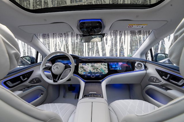
One thing about the new EQS that does resonate is the interior. The 56” MBUX Hyperscreen display is really good, but in this case, they’re not first. GM’s wide, almost full-dash display that debuted in the ’21 Cadillac Escalade arrived first, and the upcoming super-luxury flagship from Cadillac - the Celestiq - will have an even wider full screen display. But for now, I will give M-B credit – this I.P. is super-slick.
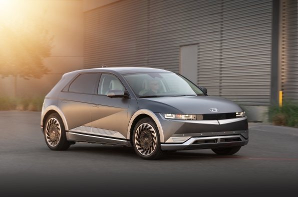
(Hyundai)
This is what Hyundai says about the new IONIQ 5 EV: “The futuristic-looking Hyundai IONIQ 5 is based upon Hyundai’s breakthrough Electric Global Modular Platform (E-GMP), which delivers faster charging, increased driving range, superior handling and more interior space. In addition to revolutionizing sustainable mobility, the IONIQ 5 offers an interior that provides a whole new in-car experience – redefining living space and moving space. Environmentally friendly materials, such as eco-processed leather and recycled yarn, are used extensively in the IONIQ 5.” This crossover/hatchback thingy is getting a lot of attention of late. For good reason. The shape is certainly not breakthrough, but the overall execution is concept-car-like. And it definitely has a distinct point of view. Is it delivering? Let's just say it has moved from being a giant “we’ll see” to it definitely seems to be.
 (Hyundai)
The IONIQ 5 interior is of the contemporary “minimalist” school of interior design, with everything packaged on screens. Not exactly an unexpected approach, but it seems clean, simple and no doubt ultra-functional. Full disclosure? I like gauges, either in place or virtually presented. And I like the new, now-obligatory screens when they look like old-school instrumentation, or can at least be programmed to look like it. That said, I’ve grown to appreciate - and really like – head-up displays, especially if they’re executed well.
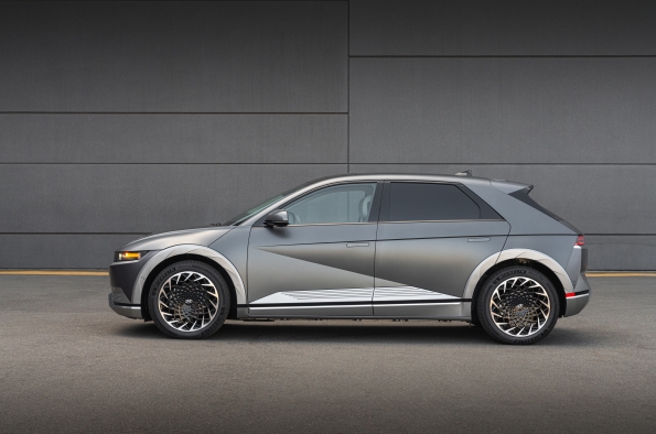 (Hyundai)
The exterior surface detailing on the IONIQ 5 is its compelling drawing card. This car will resonate with more and more buyers once they see it in real time. No, not exactly a breakthrough shape overall, but the exterior design definitely draws people in to learn more.
 (Hyundai)
The rear view of the IONIQ 5 is decidedly ho-hum, which is directly the result of the modified crossover box shape. Not a deal breaker, but not its best view by any stretch.

(Kia images)
When talking about the Hyundai IONIQ 5, you really need to add some perspective to the discussion. And that perspective comes from within the Hyundai/Kia conglomerate in the form of the Kia EV6. Based on the same EV architecture as the IONIQ 5, the Kia EV6 presents a completely different character and personality to the street. Some observers are convinced that the IONIQ 5 is the more avant-garde of the two designs, but I go back and forth on that. Yes, initially, the Hyundai seems to be more concept-car like and the Kia seems to be the more traditional of the two, but after seeing these two cars literally next to each other in a parking lot, I am not so sure about that. They both offer fresh design perspectives, with the Hyundai being more distinctive at first, but the Kia design is more subtle and has more going on beyond the first glance, especially from the rear. Both of these machines point to the burgeoning creative power of the Hyundai/Kia design house, and the fact that this is the force to be reckoned at the moment in the mainstream auto industry.


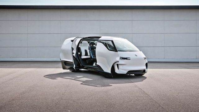
(Porsche)
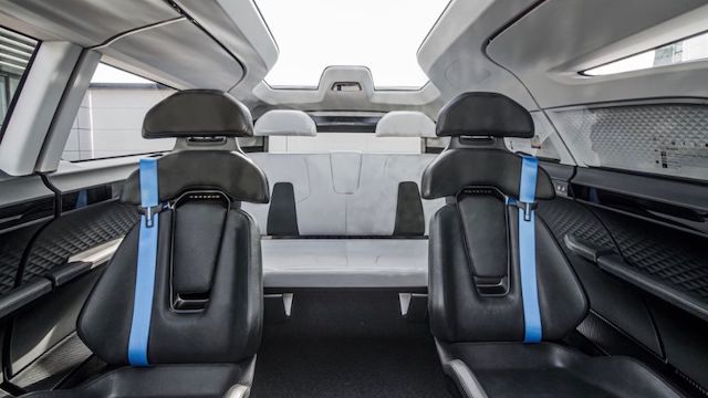
Now, for something completely different from, of all car companies, Porsche. This is what they have to say: “Insight: Interior of the Renndienst Study. The designers at Style Porsche in Weissach journey far into the future of mobility. They think and design visions for the day after tomorrow in order to derive steps for tomorrow. They ask themselves how far they can expand Porsche’s design language and to which products it could be applied. This is how the Renndienst came into being. A minivan; a family-friendly interior design concept for up to six people. Challenges such as these keep the designers’ world of ideas fresh.” How about, no? After discussing "design reach" earlier, this is a classic example of a territory that has no business being explored by Porsche, unless the car company completely walks away from anything remotely resembling its founding principles. This is one of those conceptual ideas that should have never seen the light of day. As in, WTF? And why?
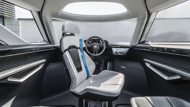 (Porsche)
Oh look, yet another execution of a future van interior. No thanks.
(Porsche)
Cringeworthy doesn’t even begin to cover it. “We thought about how we could still give a distinctly Porsche flair to a passenger compartment that is so far removed from the classic sports-car interior,” said chief designer Michael Mauer. “And how autonomous driving could be designed,” Mauer explains. The second aspect is certainly worth discussing. After all, sports cars are a symbol of self-determination. “We don’t assume that our customers want to give up using a steering wheel,” says Mauer. Oh, why not? When you’re this far gone, does it really matter? This will go down in our “Answer To The Question That Absolutely No One Was Asking” Hall of Fame.
Talking about giants like Earl and Mitchell earlier might seemly oddly out of touch when it comes to talking about the design challenges of today, but I think that is a narrow-minded perspective. As I’ve reminded my readers previously, there are car people from many disciplines slogging away at every car company on the planet. And an elite few of them may have even managed to rise to the top in their respective car companies with their spirit and passion intact, which is no mean feat in this day and age.
But in the face of a business that grows more rigid, regulated and non-risk-taking by the day, there are still lessons to be learned from the legacy of Bill Mitchell in particular. If anything, we must remember what really matters in this business above all else – something he instinctively knew in his gut – and that is to never forget the essence of the machine, and what makes it a living, breathing mechanical conduit of our hopes and dreams.
And that in the course of designing, engineering and building these machines, everyone needs to aim higher and push harder – with a relentless, unwavering passion and love for the automobile that is so powerful and unyielding that it can't be beaten down by committee-think or buried in bureaucratic mediocrity.
I just hope there are enough visionary leaders in the design community to push the discipline to new heights, while keeping the excruciating missteps to a bare minimum.
Because Design Matters, probably more so now than at any other time in automotive history.
And that’s the High-Octane Truth for this week.
Editor's Note: You can access previous issues of AE by clicking on "Next 1 Entries" below. - WG